Redesigning IDN Ads Landing Page to Convert
How we turned a frequently skipped page into one that empowers users to confidently and boldly start their first campaign.
Role
Product Designer (UX/UI)
Industry
Media Technology
Duration
1 months

Background
IDN Ads is IDN Media's advertising platform that allows brands and businesses to place article ads on a national media network. However, data shows that the majority of landing page visitors don't proceed to the campaign creation stage.
Observations and user feedback revealed that visitors don't yet understand what they're getting from advertising on IDN Ads, so there's no compelling reason to try. They need to be convinced, not simply told.
What Challenges Did We Need to Tackle?
The value proposition doesn't feel real (Clarity)
Users don't immediately understand tangible benefits like "articles will be live forever" or "you can rank higher on Google." The information is there, but it's not presented in a compelling way.
There's no strong trust driver (Trust)
New users don't yet know the extent of the IDN Media network. Without social proof or concrete evidence, skepticism outweighs curiosity.
There's no CTA directing each section (Direction)
The CTA is only available at the beginning of the page. Users who are only convinced after reading section 3 have no direct path to action.
The content feels passive and textual (Engagement)
There are no visual elements that help users quickly scan for benefits. The wall of text makes users choose to skip.
How Might We?
How Might We is an open-ended question that helps us discover possible solutions to a problem, without immediately determining the answer.
HMW makes the benefits of advertising tangible and long-term, not just "placing an ad"?
HMW places CTAs at the most opportune moments, when users are already educated and ready to act?
Does HMW build a sense of control and trust in IDN Ads from the first second they land on the page?
Design Process
Discovery & Data Analysis
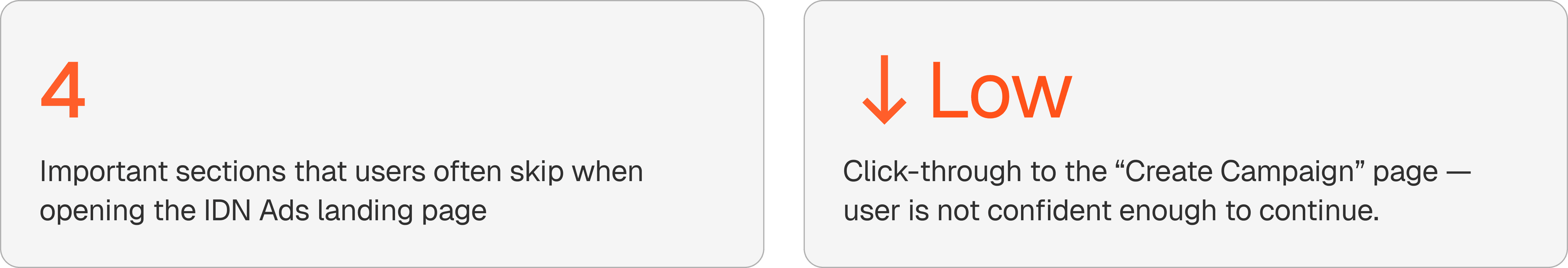
Reading PostHog data: heatmap, scroll depth, and click tracking. Identifying which sections are most skipped and measuring how far users scroll before leaving the page. The result: the majority of users drop off before reaching the "IDN Ads Advantage."
User Insight Synthesis
Gathering qualitative feedback from users who had visited the page but not created a campaign.
Key finding: They didn't understand the difference between IDN Ads and regular social media boosts, and weren't sure whether it was worth it in terms of cost and impact.
Information Architecture Restructuring
Remapping the content hierarchy. Moving the highlighted value proposition to a higher position on the page. Designing a narrative flow: What is this → Why is it relevant → What do you get → How does it work → Get started now.
Design & Copywriting Alignment
Transform each value point from a long text into an easy-to-scan pill/tag format. Work with the content team to write copy that speaks to tangible outcomes (not technical features). Test each sentence: "Does this answer the user's 'so what?' question?"
Usability Testing & Iteration
Conduct A/B testing after the platform's launch and measure whether users can recall the top three reasons for advertising on IDN Ads after 90 seconds. Conduct two iterations based on the test results.
Final Design
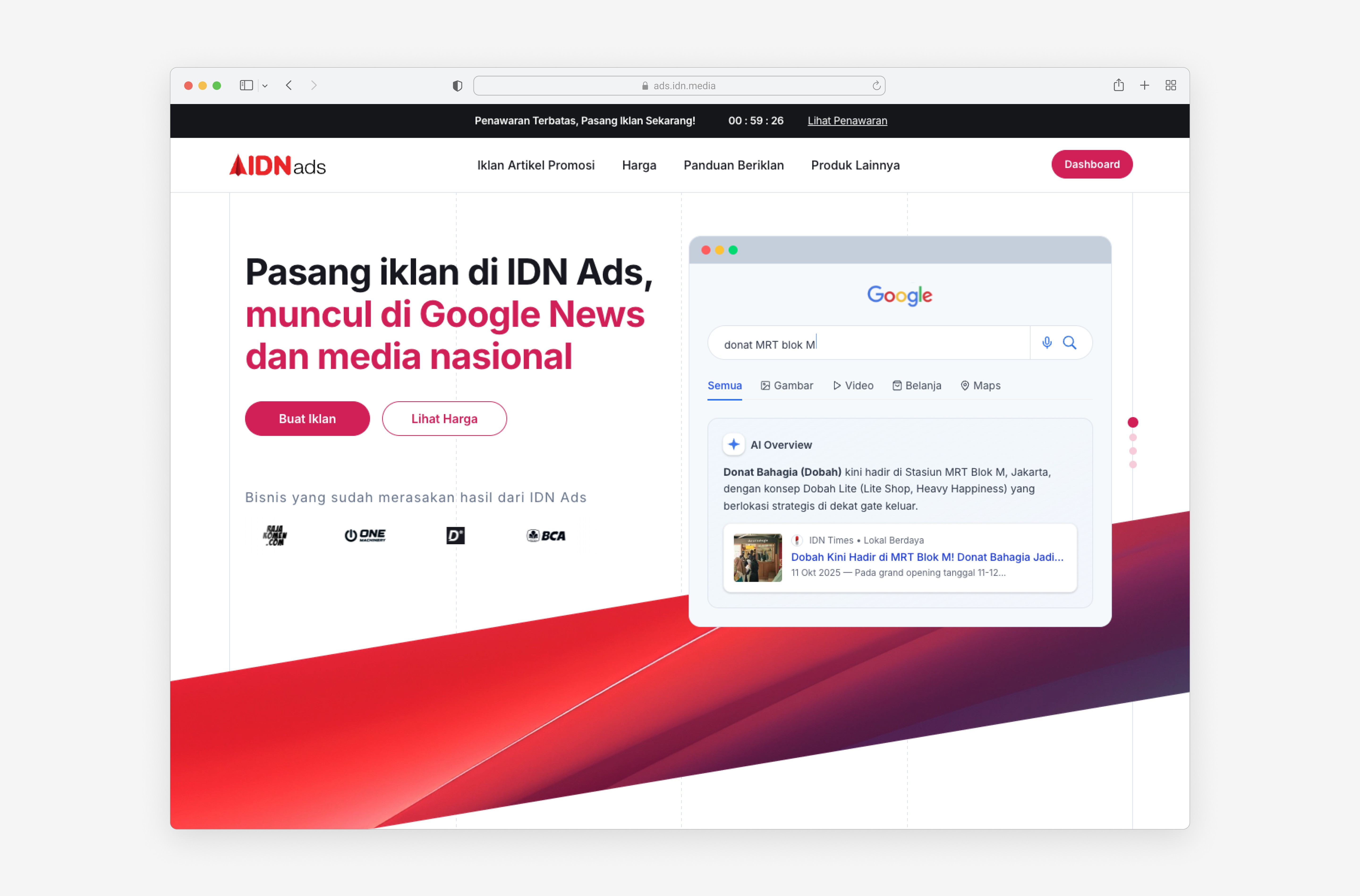
Below is a visual reconstruction of the redesigned IDN Ads landing page. Each section is designed with a specific value and includes a contextual CTA.
Hero Section Page
UX principles & psychology at work:
F-pattern and typography sizes
The large headline in the top left follows a natural reading pattern. The user's eye first falls to the heading, then down to the subtext, then to the CTA.
Headlines focus on results, not features
"Appearing in Google News and national media", this is talking about the real outcomes that users want.
Social proof trusted brand logos below the CTA
The brand logo is placed directly below the CTA in the most critical position. This alleviates any last-minute hesitation before users decide whether to click or not.
Countdown timer in the announcement bar
The “Limited Offer” top bar with a 59:26 countdown creates time pressure that encourages faster decisions.
How to Section Page
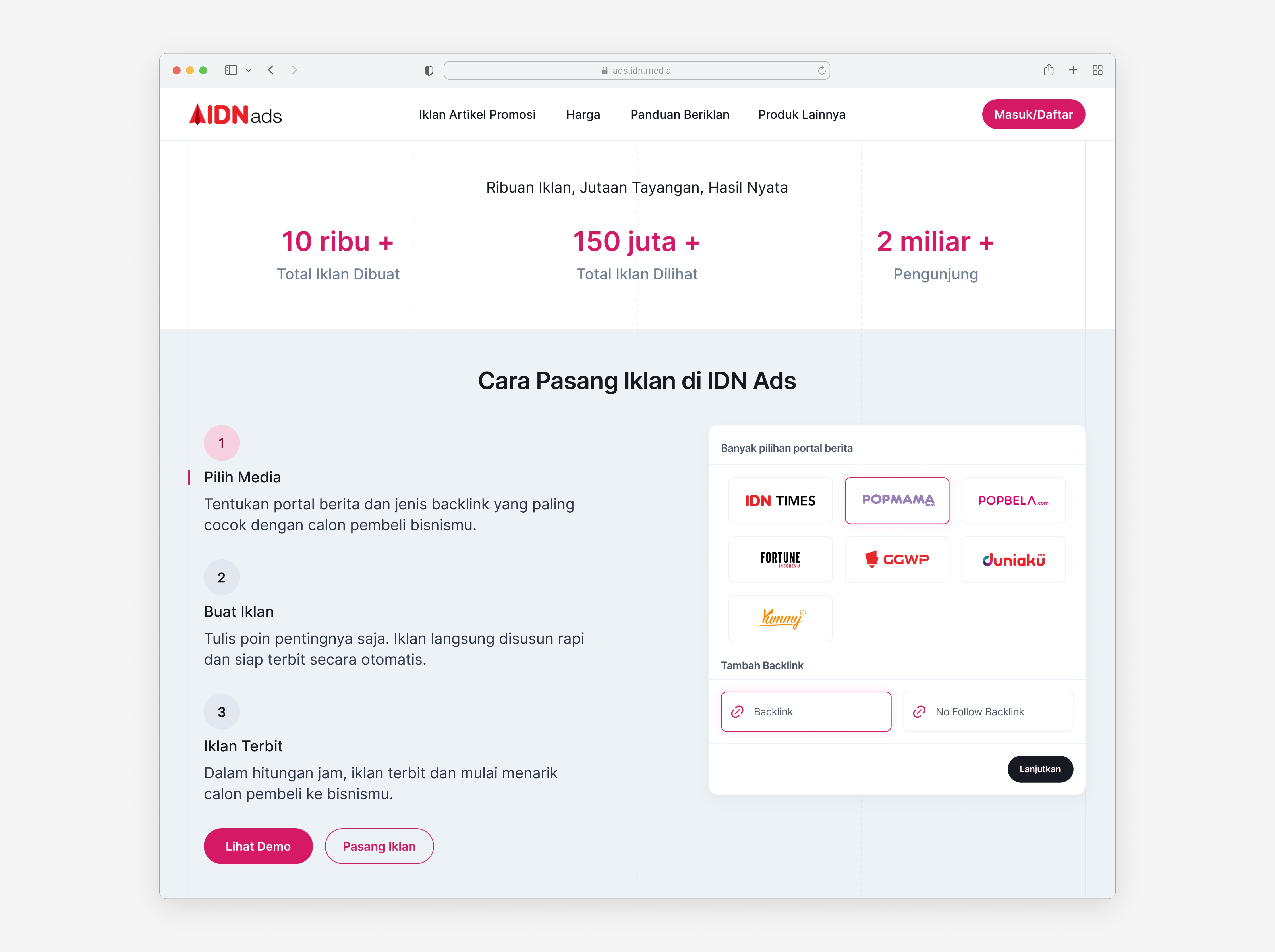
UX principles & psychology at work:
Big number metrics as an anchor of trust (Bandwagon Effect)
"10,000" , "150 million" , "2 billion" trigger a bandwagon effect: if it's widely used, it's safe and proven. This alleviates doubts without the need for lengthy arguments.
Order of numbers from smallest to largest (Anchoring Effect)
10,000 → 150 million → 2 billion. This sequence creates an increasingly surprising anchoring effect the final number feels more dramatic because of the comparison before it.
Large typography + brand colors in main numbers (Visual Weight & Hierarchy)
The large numbers and pink-red color ensure the eye immediately grasps the most persuasive data first, before reading the labels below.
3 steps: simplifying complexity (Progressive Disclosure)
The advertising process, which can seem complicated, is condensed into three steps. This reduces perceived effort, preventing users from feeling "oh, it's that easy?" before even starting.
Interactive media card on the right (Endowment Effect Live Preview)
Users can directly select media and backlinks in the preview card before registering. This triggers the endowment effect: once users start "touching" the product, a sense of ownership increases and the likelihood of conversion increases.
Impact
The following are the projections and target impacts of this redesign based on internal benchmarks.
A/B Testing Landing Page
Result: Variant 2 remains higher than Variant 1.
Key Insight: Users understand more quickly if the initial message is clarified without completely, changing it.
Recommendation: Implement Variant 2.
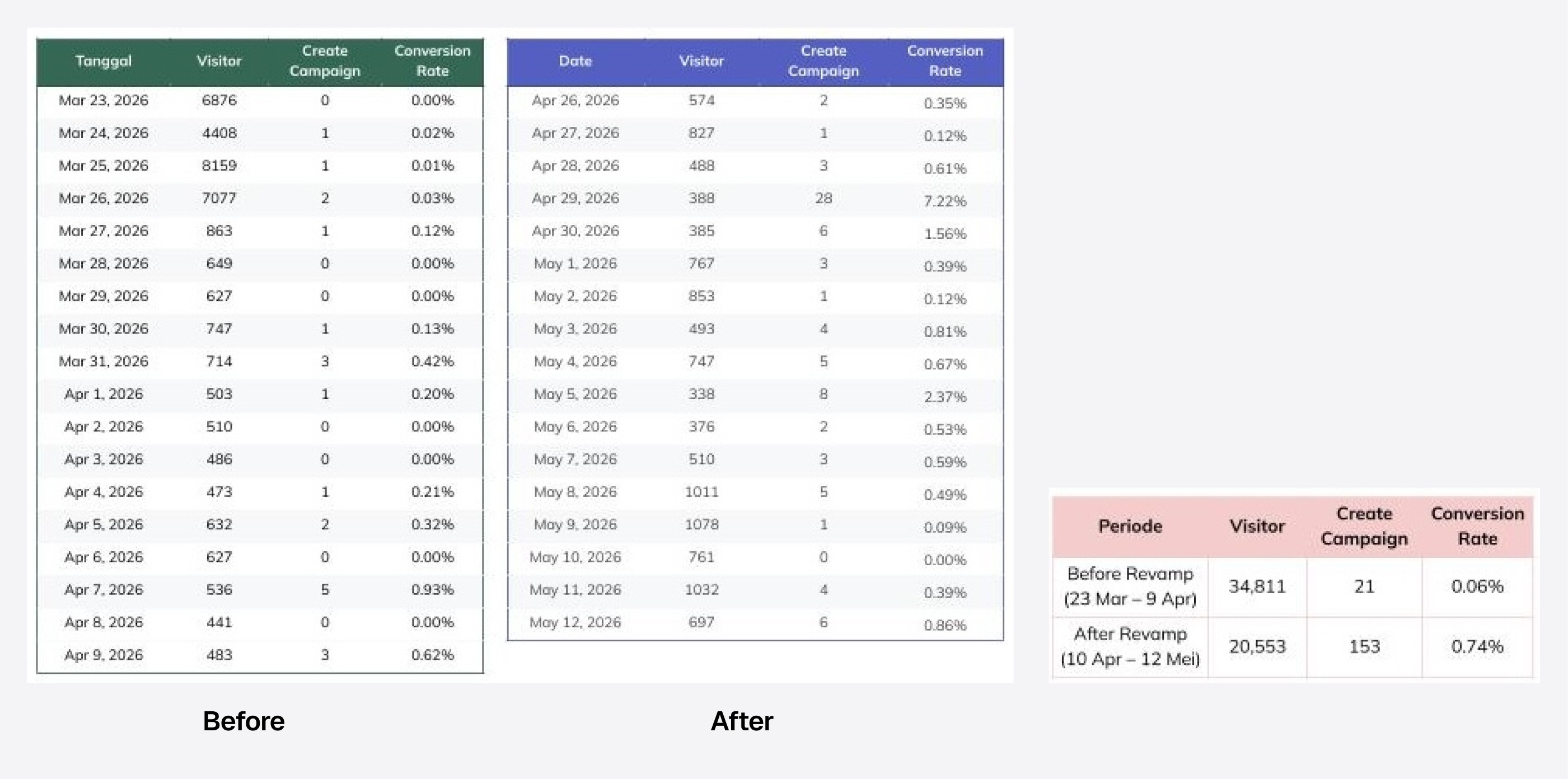
Despite the drop in visitors, conversion effectiveness increased 12x.
The revamp successfully encouraged more users to create campaigns from less traffic.


